Wired UK
A series of data visualizations were created for Wired UK, transposing information on topics like SpaceX, submarine cables, and video games into compositions that could bring clarity to complex issues. Created in close dialogue with the publication’s editorial team, each gave raw information a distinctly composed aesthetic, enhancing the magazine’s content and data legibility. These visualizations not only enhanced WIRED UK's editorial content, but also provided readers with insightful and visually engaging interpretations of complex data.
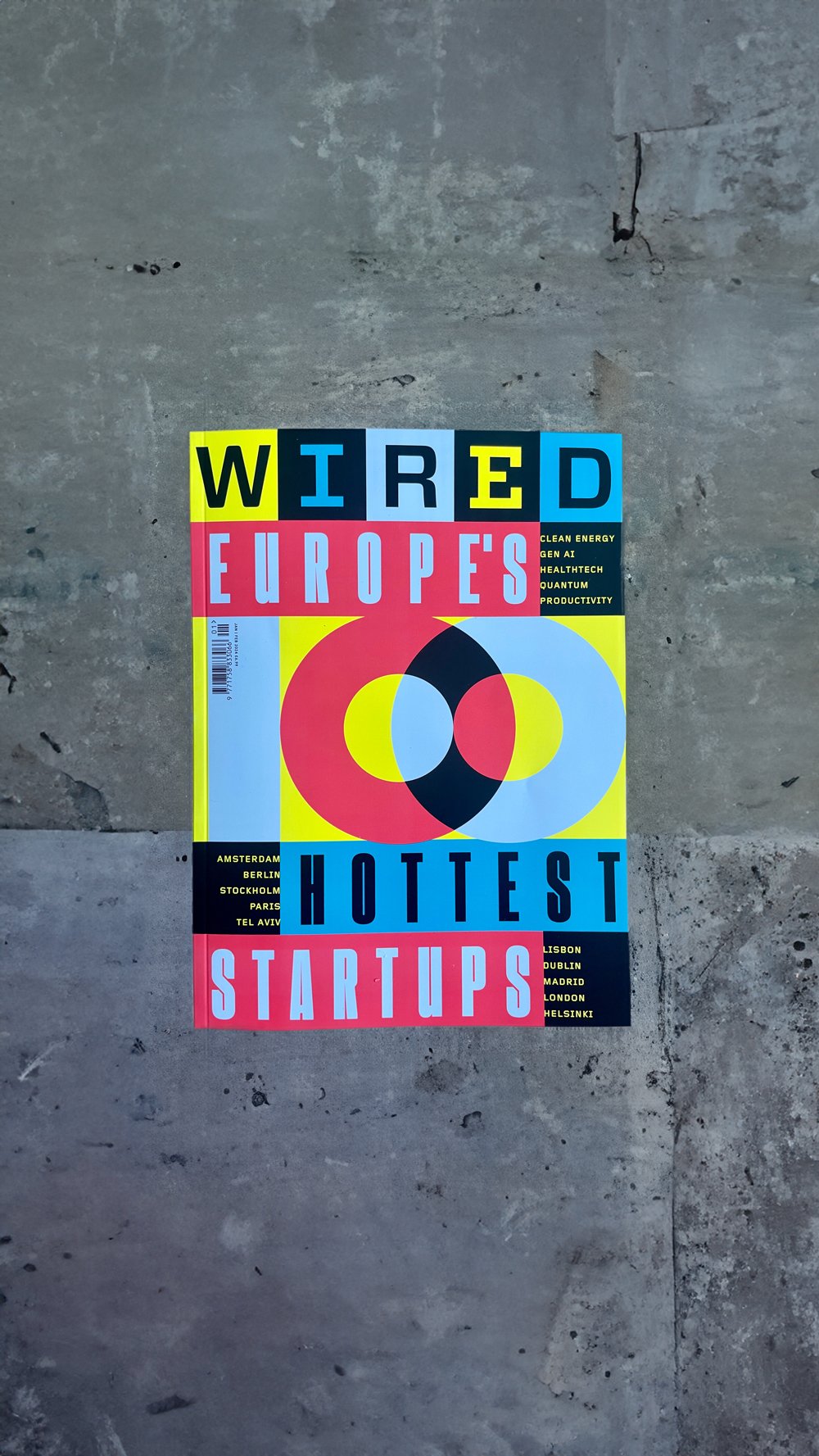
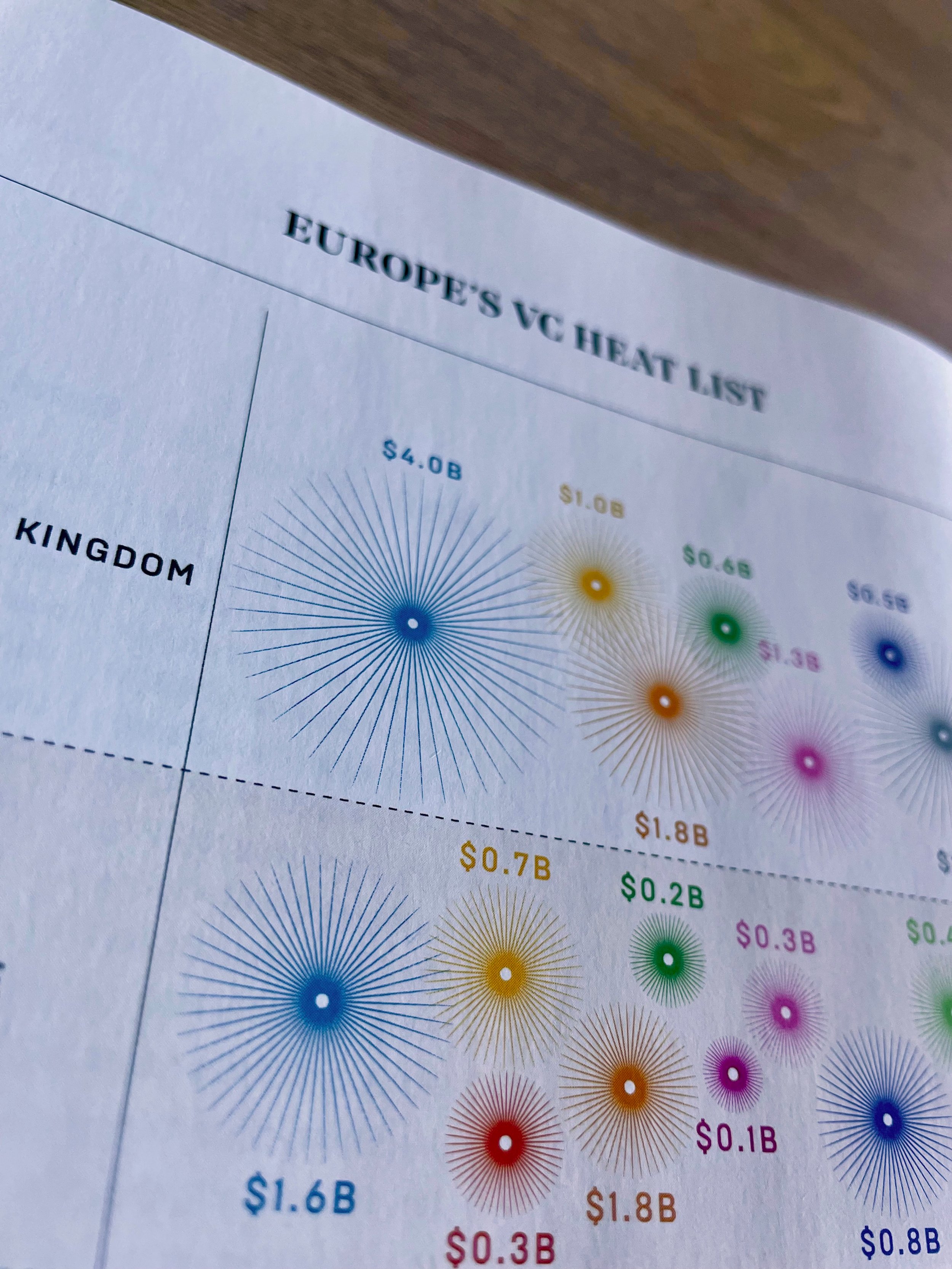
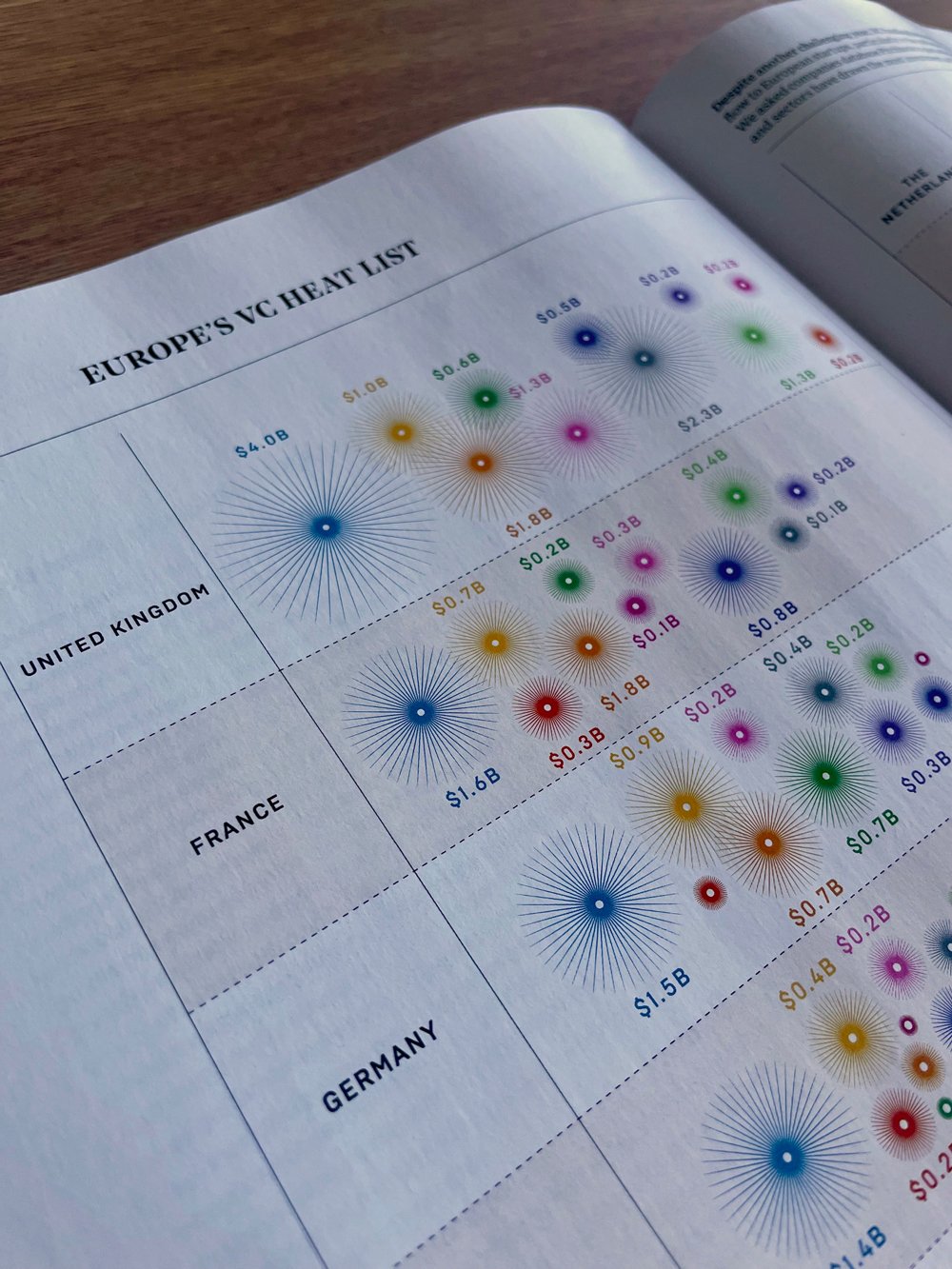
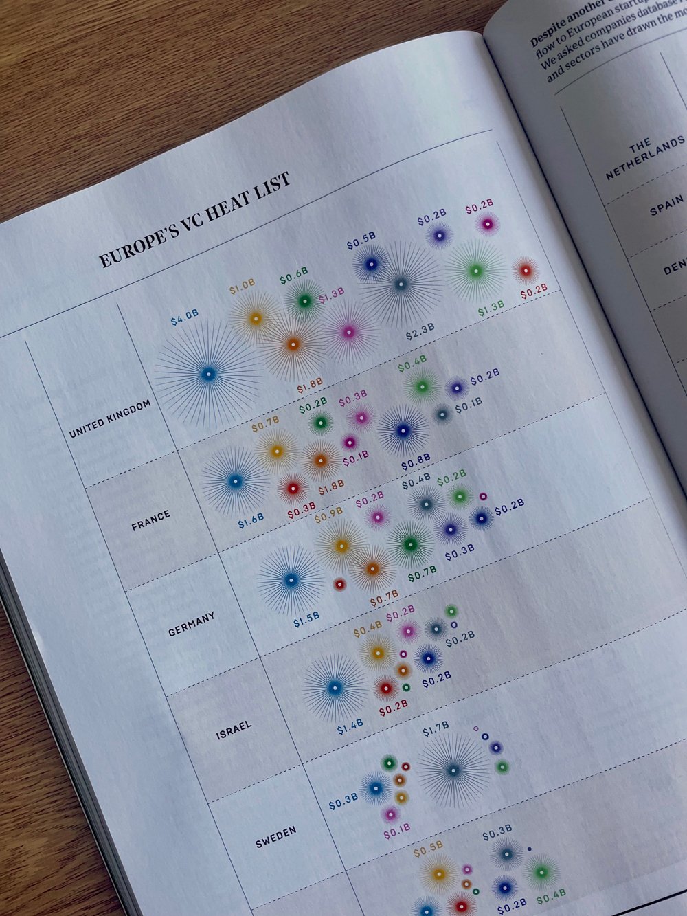
100 Hottest Startups, 2023
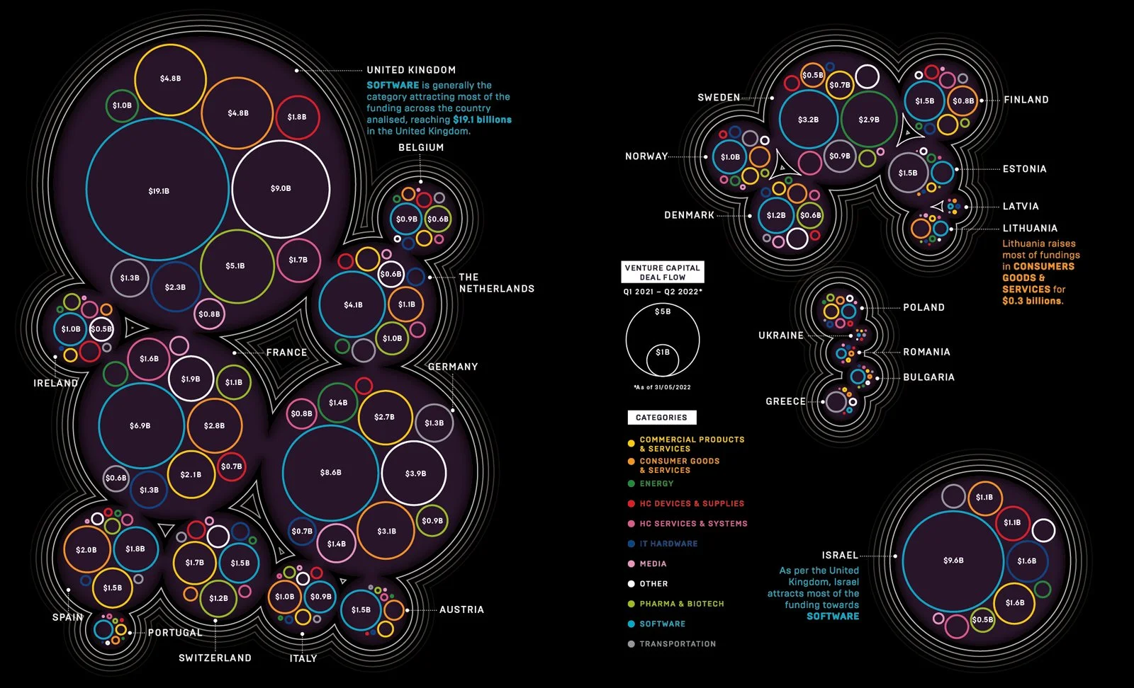
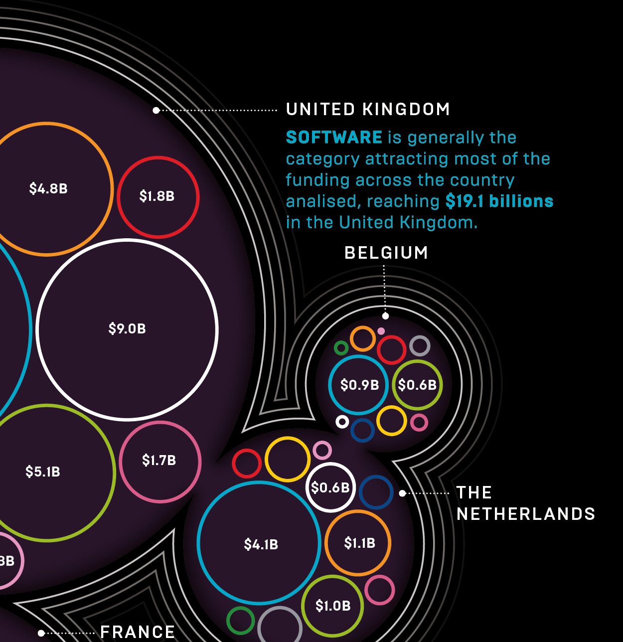
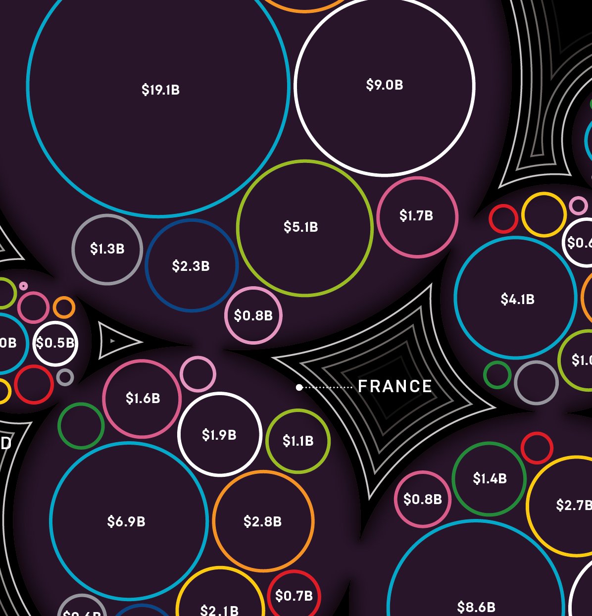
For the 100 Hottest Startups special issue of WIRED UK, published in both 2022 and 2023, comprehensive guides to Europe's startup ecosystem were visualised, showcasing evolving tech sectors and investment trends.
SpaceX and the recycled space race, 2022
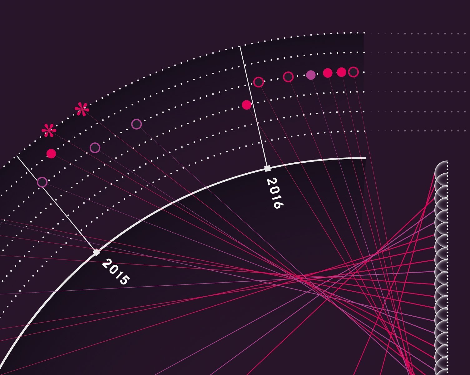
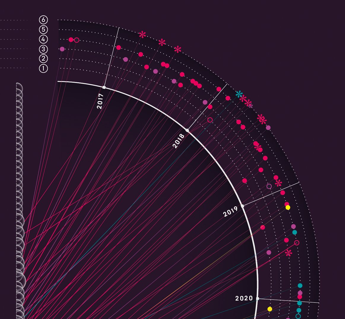
In another feature, SpaceX and the Recycled Space Race, from May 2023, designs highlighted SpaceX's transformative Falcon 9 launches and booster landings, underscoring the affordability of reusable rockets.
All over the map, 2022
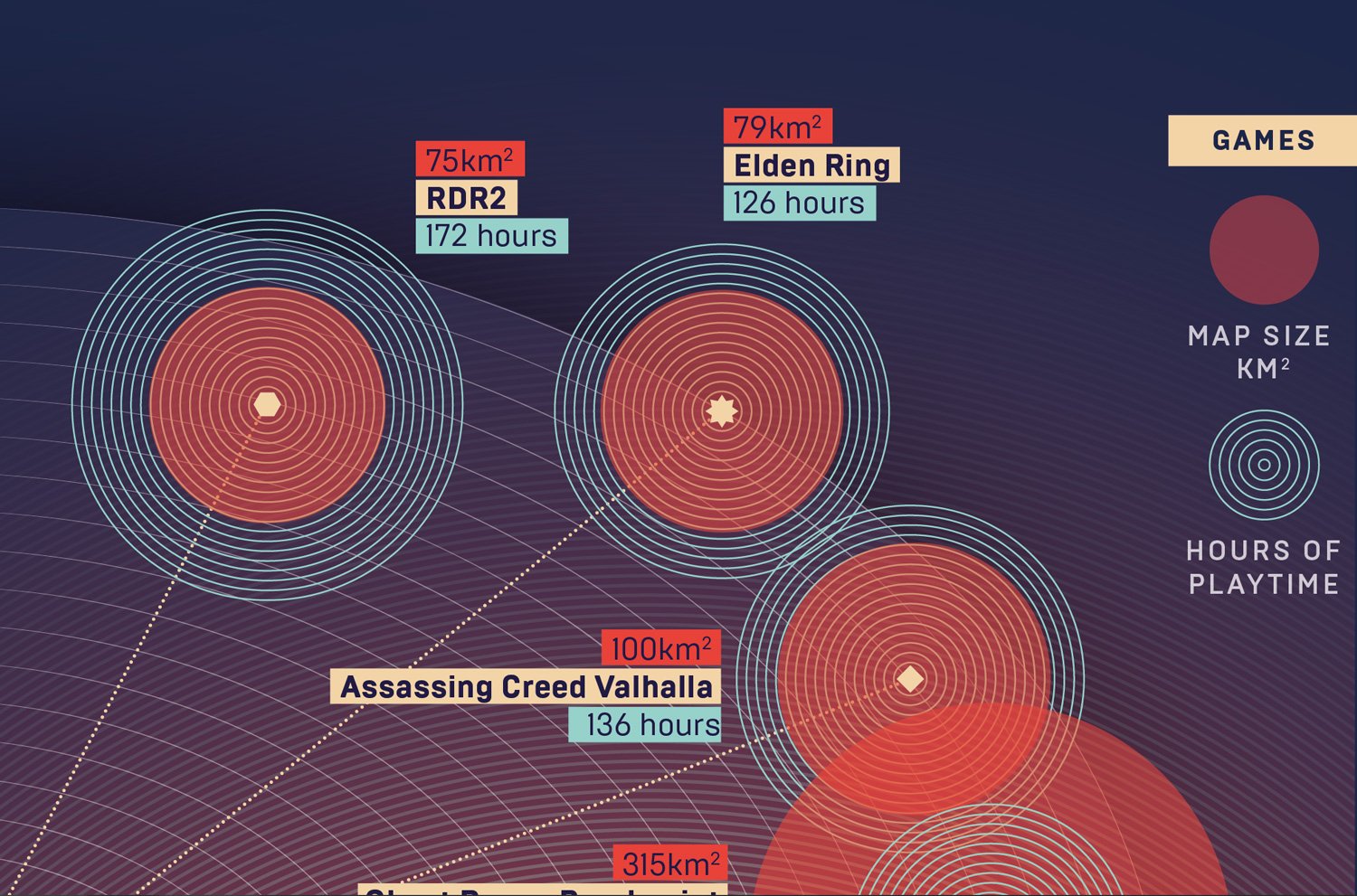
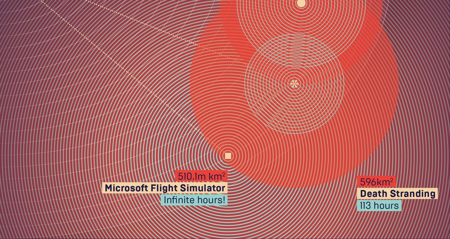
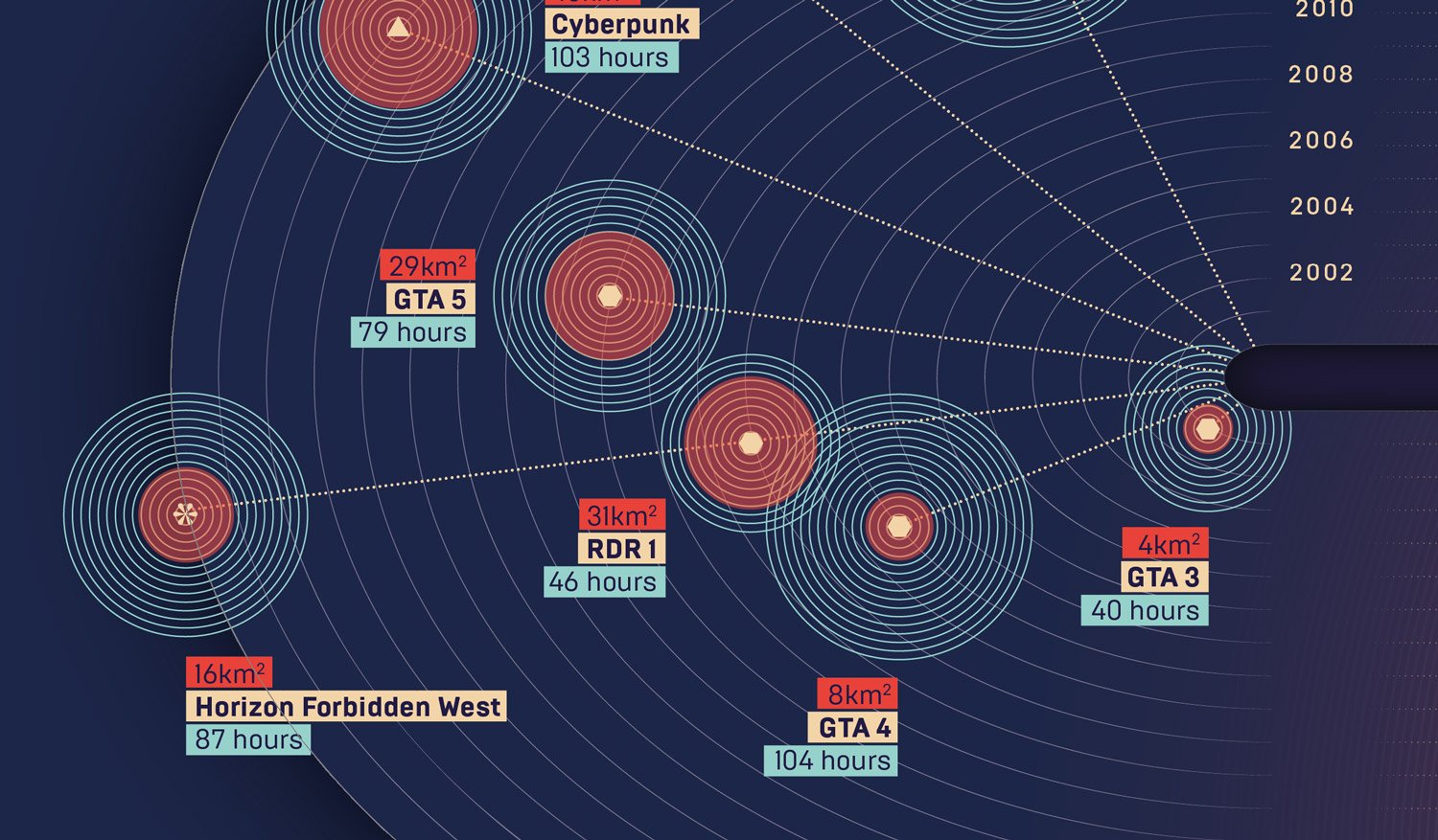
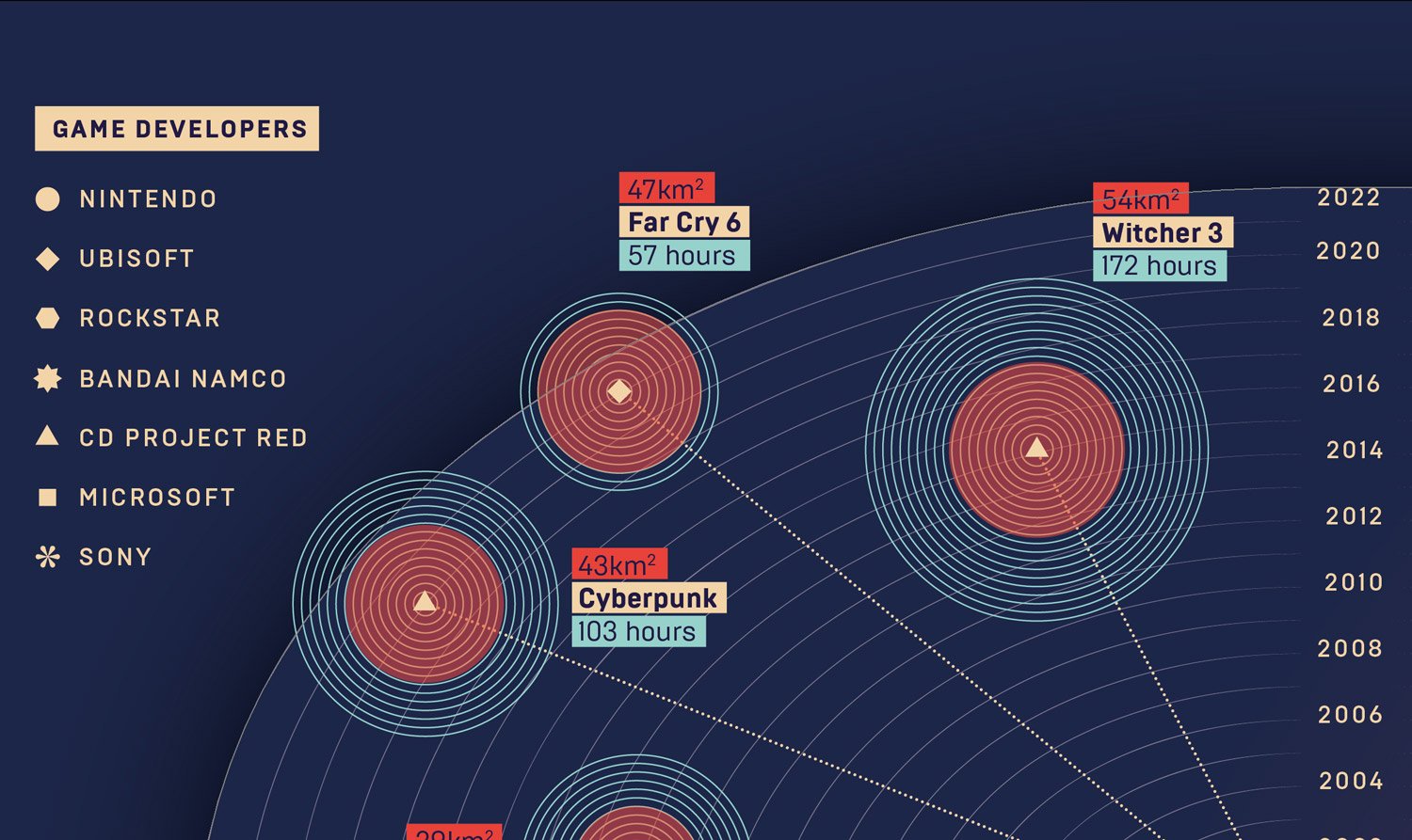
In All Over the Map from September 2023, the expansive worlds of video games like GTA 3 and Death Stranding were explored, correlating playable areas with gameplay hours.
Breaking the loop, 2023
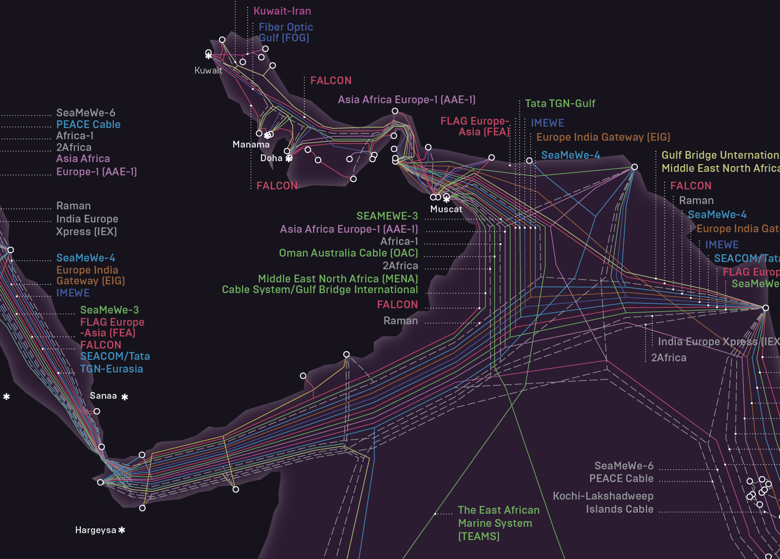
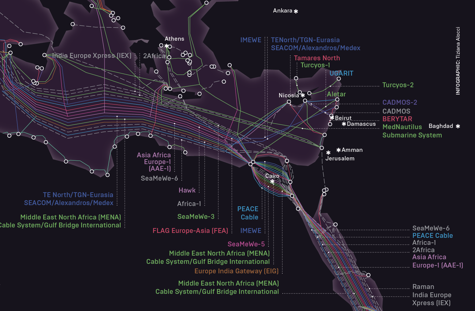
Breaking the Loop, published in March 2023, mapped global submarine cables crucial for international data transmission, illustrating their role in global connectivity.

