Transforming data into meaningful stories
Tiziana Alocci is a London-based data artist, international speaker and lecturer working at the intersection of art and technology. Creating data-driven compositions out of invisible phenomena such as sleep patterns, soundscapes, movement of people, and perfumes, she makes the intangible tangible, the invisible visible interlacing science with poetry.
Lufthansa Group – Voyages of Wonder
Miles & More, a Lufthansa Group initiative, commissioned a series of gifts to loyal clients in the form of bespoke data portraits of their travels.
How I transformed frequent flyers data into unique data portraits.
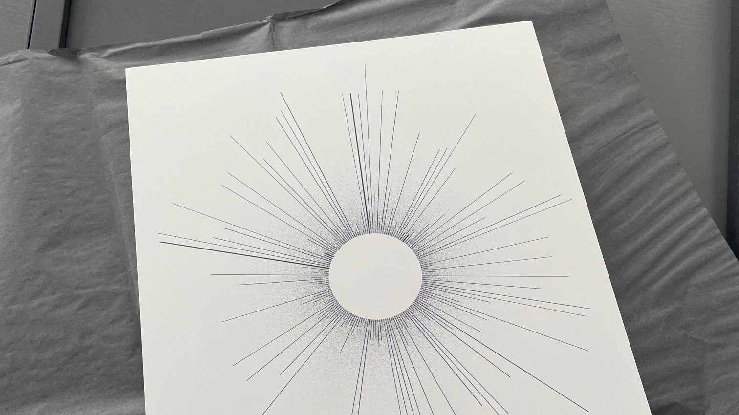
“Voyages of Wonder” is a gift from Miles & More to their most loyal clients. Imagine if every flight you took could create a unique shape, telling a story of your travels. That was the case for passengers whose journeys have been reimagined into a series of bespoke data portraits.
The process of turning data into art starts with numbers. In this context, each dataset is like a personal diary, an unopened letter containing moments to remember.
Someone once said that art is intentional making with unintentional outcomes. This holds true in every data-driven piece I do. While data visualisation tools can automate the process, I believe it is crucial to transcend the basic representation of data and connect with the viewer on an emotional level.
Transforming raw data into a meaningful story requires a deep understanding of the subject matter and a keen eye for detail. It is through this meticulous process that I am able to breathe life into the data and create something impactful and relatable.
Similarly, in “Voyages of Wonders" I sought to transform the mundane data of flight frequencies, destinations, and durations into abstract photographs. Each piece is a visual representation of its individual travel story.
The Process
It all starts with numbers – a log of flights and destinations.
The transformation is a meticulous process, which I have precisely documented with sketches and video recordings. It is where intuition meets code and data visualisation conventions.
Each piece is customised based on individual passenger data, making no two pieces look the same.
Each line represents a flight route, with its size determined by the length of the route flown – the longer the line, the greater the distance from departure to arrival.
Then, I visualised frequency by adjusting the thickness of the lines – thicker lines represent routes that have been flown more frequently.
The Generative Tool
The key factor that contributed to the success of this release was the custom generative tool created in collaboration with Francisco Estivallet.
Colour test featuring a rejected version of the visualisation. The more lines, the more routes were flown by a passenger.
Final Piece(s) And Packaging
Each unique art piece from the "Voyages of Wonder" series is carefully packaged in a custom box, accompanied by a hand-signed note. The artwork itself is signed, printed, and mounted on Aluminium Dibond support. The attention to detail in the packaging ensures that each customer receives a truly special and personalised experience when they receive their artwork.
The custom box not only protects the artwork during transit but also adds an element of anticipation and excitement as the recipient opens it to reveal their one-of-a-kind piece.
Credits: Thanks to TRACK GmbH, Miles & More, and Lufthansa Group for this beautiful collaboration.
Wired UK
Data visualisation compositions on topics like SpaceX, submarine cables, and video games were designed to bring clarity to complex issues commissioned by Wired UK.
A series of data visualizations were created for Wired UK, transposing information on topics like SpaceX, submarine cables, and video games into compositions that could bring clarity to complex issues. Created in close dialogue with the publication’s editorial team, each gave raw information a distinctly composed aesthetic, enhancing the magazine’s content and data legibility. These visualizations not only enhanced WIRED UK's editorial content, but also provided readers with insightful and visually engaging interpretations of complex data.
100 Hottest Startups, 2023
For the 100 Hottest Startups special issue of WIRED UK, published in both 2022 and 2023, comprehensive guides to Europe's startup ecosystem were visualised, showcasing evolving tech sectors and investment trends.
SpaceX and the recycled space race, 2022
In another feature, SpaceX and the Recycled Space Race, from May 2023, designs highlighted SpaceX's transformative Falcon 9 launches and booster landings, underscoring the affordability of reusable rockets.
All over the map, 2022
In All Over the Map from September 2023, the expansive worlds of video games like GTA 3 and Death Stranding were explored, correlating playable areas with gameplay hours.
Breaking the loop, 2023
Breaking the Loop, published in March 2023, mapped global submarine cables crucial for international data transmission, illustrating their role in global connectivity.
La Lettura
Beginning in 2019, a collaboration with La Lettura, Corriere della Sera's cultural supplement has resulted in a series of intricate data visualizations revealing data around weekly top global artists, paired with contextual articles, together blending art with information and popular culture.
Beginning in 2019, a collaboration with La Lettura, Corriere della Sera's cultural supplement has given rise to a series of intricate data visualizations revealing data around weekly top global artists, paired with contextual articles, together blending art with information and popular culture.
The Periodic Table of the Discoverer of the Elements
Within the series, the work titled Periodic Table of the Discoverer of the Elements commemorated UNESCO's International Year of the Periodic Table in 2019. This visualization revisited the iconic Periodic Table, spotlighting the scientists behind its discoveries and tracing its evolution from conception to its contemporary significance.
EGOT Club, The most exclusive showbiz club
Another notable work was the EGOT Club, which focused on the exclusive group of individuals achieving Emmy, Grammy, Oscar, and Tony Awards. This visual journey detailed the esteemed EGOT winners, highlighting their milestones and the cultural impact of their achievements.
Alien Species
A visualization on Alien Species shed light on the ecological impact of invasive plants and animals introduced into new environments, disrupting ecosystems and threatening biodiversity.
European long-distance paths
The exploration of European long-distance paths was the subject of another visualization, highlighting twelve scenic routes spanning 60,000 kilometres across 28 countries, inviting enthusiasts to explore nature's beauty and enhance cognitive abilities through walking.
1969, Sellerio – A Vast Array of Literature
In another edition, a tribute to the 50th anniversary of Sellerio held during the Salone del Libro in Turin was visualised, where the renowned publishing house celebrated for titles like the Commissario Montalbano series, reflected on its literary contributions.
National Anthems, year of adoption per country
Lastly, the National Anthems visualization, timed with the Tokyo Olympics, chronologically arranged participating nations based on the adoption year of their national anthems, showcasing the rich cultural tapestry of countries joining the global event.
Selected clients
The National Gallery (London), Unit London, Lufthansa Group, British Library, David Gilmour, Condé Nast, Robertet Group, The Orb, The Guardian, Thomson Reuter Foundation, Corriere della Sera, University of the Arts London, Open Data Institute, Sum Over Histories, BBC, RCS Media Group, Signal Noise, Nexus Agency, HUGE Inc.